Important Python Packages
Apparently, pypi keeps track of python package downloads and moreover publishes those numbers in a BigQuery table. In other words, we can easily see the most downloaded python packages and with a little bit of work, their dependencies. These packages and their direct dependencies form a natural Directed Graph that we can explore using networkx. Networkx is fairly popular python package for network analysis.
Alas, first step is getting the list of packages and their corresponding download counts for the last 3 months from pypi. For sake of simplicity, I will just use the top 1000 packages for analysis:
SELECT
  file.project as project,
  COUNT(*) as download_count,
FROM `bigquery-public-data.pypi.file_downloads`
WHERE timestamp BETWEEN TIMESTAMP_ADD(CURRENT_TIMESTAMP(), INTERVAL -91 DAY) AND TIMESTAMP_ADD(CURRENT_TIMESTAMP(), INTERVAL -1 DAY)
  AND details.installer.name = "pip"
GROUP BY
  project
ORDER BY
  download_count DESC
LIMIT 1000
which results in the following csv file:
$ head -n5 bquxjob_1376009a_17ca30d41ab.csv
project,download_count
botocore,603153768
urllib3,551819872
boto3,501912392
six,478650284
Hmm, botocore was the most downloaded package in the last 3 months.
Anyway, what we would like to do is find out the dependencies of these packages which we will later use to form a graph for analysis. Basically, download and install each package in a virtual environment, find out its direct dependencies and uninstall:
while IFS= read -r f;
do
  python -m pip install --disable-pip-version-check --no-deps ${f} > /dev/null
  deps=$(python -m pip show --verbose ${f} | grep Requires | cut -d" " -f2- | tr -d '[:space:]')
  # have everything in lowercase
  lineout="${f,,},${deps,,}"
  # no trailing comma in case there are no dependencies
  echo ${lineout%,}
  # do not uninstall modules needed for pip install to run
  case ${f} in
    pip|setuptools)
      ;;
    *)
      python -m pip uninstall -y ${f} > /dev/null
      ;;
    esac
done
which results in a file similar to below:
$ head -n5 projects_with_dependencies.csv
botocore,urllib3,jmespath,python-dateutil
urllib3
boto3,jmespath,botocore,s3transfer
six
s3transfer,botocore
The first line of that file basically says that botocore depends on urllib3, jmespath and python-dateutil packages. Unfortunately, I couldn’t install all 1000 packages because some required windows, others didn’t support python-3.9 (I am looking at you tensorflow, well, sub-packages of tensorflow) etc and I didnt want to spend too much time trying to get all 1000 packages installed.
Another thing to keep in mind is that we are disregarding any optional dependenies. In other words, to take Dask as an example, we are only considering the core dependencies of Dask as we are running pip install dask rather than pip install dask[complete] in the above script.
Let’s unstack the dependencies:
import csv

L = list()

with open("projects_with_dependencies.csv") as csvfile:
    csv_reader = csv.reader(csvfile)
    for row in csv_reader:
        for i in range(1, len(row)):
            L.append([row[0], row[i]])

with open("projects_with_dependencies_unstacked.csv", mode="w") as outfile:
    csv_writer = csv.writer(outfile)
    csv_writer.writerows(L)
to get the following file:
$ head -n5 projects_with_dependencies_unstacked.csv
botocore,urllib3
botocore,jmespath
botocore,python-dateutil
boto3,jmespath
boto3,botocore
so that edges are obvious and easy to import. Finally, we can form our graph for analysis:
import csv
import networkx as nx


# form the graph
with open("projects_with_dependencies_unstacked.csv") as csvfile:
    csv_reader = csv.reader(csvfile)
    G = nx.DiGraph(csv_reader)

print(f"{len(G)} nodes, {nx.number_of_edges(G)} edges")

attributes = dict()

# add counts as node attributes for the top 1000 projects
with open("bquxjob_1376009a_17ca30d41ab.csv") as csvfile:
    csv_reader = csv.DictReader(csvfile)
    for row in csv_reader:
        attributes[row['project']] = int(row['download_count'])

nx.set_node_attributes(G, attributes, 'downloads')
# set nulls, i.e. nodes not in top1000, to 0
nulls = {node: 0 for node in G if 'downloads' not in G.nodes[node]}
nx.set_node_attributes(G, nulls, 'downloads')

# write the graph out
with open("python-ecosystem.graphml", "wb") as outfile:
    nx.write_graphml(G, outfile)
Yey, finally some numbers:
>>> G = nx.read_graphml("python-ecosystem.graphml")
>>> print(f"{nx.number_of_nodes(G)} nodes")
927 nodes
>>> print(f"{nx.number_of_edges(G)} edges")
2173 edges
>>> print(f"density = {nx.density(G):.4f}")
density = 0.0025
That low density number is pretty normal for this type of graph afaik.
>>> print(list(nx.isolates(G)))
[]
Good. There are no isolates, i.e. nodes without any edges.
Centralities
One of the goals of network analysis is to identify outstanding actors. Traditionally, this is measured via centrality. As we can measure importance of a node in several different ways - number of edges, distance to all other nodes etc - there are several centrality measures (several hundred to be more precise). We can do a centrality analysis by calculating different centralities for our graph and comparing them:
dgr = nx.degree_centrality(G)
clo = nx.closeness_centrality(G)
har = nx.harmonic_centrality(G)
eig = nx.eigenvector_centrality(G, max_iter=500)
bet = nx.betweenness_centrality(G)
pgr = nx.pagerank(G)
hits = nx.hits(G)

centralities = pd.concat(
    [pd.Series(c) for c in (hits[1], eig, pgr, har, clo, hits[0], dgr, bet)],
    axis=1
)

centralities.columns = (
    "authorities",
    "eigenvector",
    "pagerank",
    "harmonic closeness",
    "closeness",
    "hubs",
    "degree",
    "betwenness"
)
centralities["harmonic closeness"] /= centralities.shape[0]
Each centrality measure (except nx.hits) returns a dictionary with nodes as keys and centralities as values. nx.hits returns a list of 2 dictionaries. We also normalize harmonic closeness centrality as it is the only measure on the list that is not automatically normalized.
c_df = centralities.corr()
ll_triangle = np.tri(c_df.shape[0], k=-1)
c_df *= ll_triangle
c_series = c_df.stack().sort_values()
print(c_series.tail())
centralities.corr() calculates all pairwise correlations between the centralities and returns an 8*8 symmetric dataframe. More than half of the values in the dataframe are redundant. So, use np.tri() to generate a lower left triangle of 1’s and mask the duplicates by multiplying the dataframe with the mask. Finally, put the values in a pd.Series, sort the values and display the last 5 rows.
degree              pagerank              0.762998
                    authorities           0.772640
closeness           pagerank              0.895620
harmonic closeness  pagerank              0.912452
closeness           harmonic closeness    0.998127
dtype: float64
Centrality measures basically form 4 groups in our graph. One group consists of closeness, harmonic closeness, pagerank, degree and authorities. eigenvector, hubs and betweenness form their own individual groups.
>>> print(sorted(nx.pagerank(G).items(), key=lambda x:x[1], reverse=True)[:5])
[('six', 0.04674284709917218), ('requests', 0.02355785328320957), ('numpy', 0.016864174414911445), ('msrest', 0.012937285077731005), ('azure-common', 0.012067479324494926)]
>>> print(sorted(nx.betweenness_centrality(G).items(), key=lambda x:x[1], reverse=True)[:5])
[('requests', 0.0008258906855019165), ('msrest', 0.0006950362889887727), ('azureml-core', 0.0003633811997742882), ('tensorflow', 0.0002173253166773685), ('google-api-core', 0.00021335590450061292)]
>>> print(sorted(nx.eigenvector_centrality(G, max_iter=500).items(), key=lambda x:x[1], reverse=True)[:5])
[('pycparser', 0.5677206884960123), ('certifi', 0.41151913578923976), ('urllib3', 0.41120372655468423), ('idna', 0.4112037228469602), ('charset-normalizer', 0.41120372284688655)]
PageRank was developed by Google (and named after Larry Page) to rank web pages. The rank of a node in the network is calculated as the probability that a person randomly traversing the edges will arrive at the node. The node with the highest PageRank is the most attractive: no matter where you start, this node is the most likely destionation. In our graph, six is the package with highest PageRank.
The betweenness centrality measures the fraction of all possible shortest paths, geodesics to be more precise, that pass through a node. If the betweenness is high, the node is potentially a crucial go-between and the removal of such a node possibly splits the network into disconnected parts. In our graph, requests is the package with highest betweenness centrality.
Eigenvector centrality has a somewhat recursive definition. Basically, it says “tell me who your friends are and I will tell you who you are”. High eigenvector centrality identifies nodes surrounded by other high eigenvector central nodes and can be used to locate groups of nodes with high prestige. In our graph, pycparser is the node with the highest eigenvector centrality.
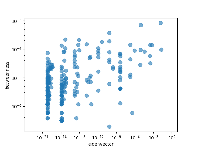
We can easily check the correlations visually as well:
X = "eigenvector"
Y = "betweenness"
centralities.plot(
    kind="scatter",
    x=X, y=Y,
    loglog=True, alpha=0.6,
    s=75
)
plt.show()
which results in the following graph:

There does not seem to be much of a relationship as expected from the correlation numbers.
Communities
In a directed graph, strongly connected components are the maximal set of nodes such that for every pair of nodes u and v, there is a directed path from u to v and from v to u.
>>> print(len(list(nx.strongly_connected_components(G))))
927
927 different components! But this somewhat expected as we do not want circular dependencies between our packages (A depends on B depends on C depends on A) as that would indeed make it somewhat of a challange to install the relevant packages.
Weakly connected components are similar but we can traverse the links in the opposite direction as well, i.e. we can treat the links as undirected.
>>> print(len(list(nx.weakly_connected_components(G))))
13
In other words, we have 13 different weakly connected components in our graph.
The problem of finding groups of nodes in networks is called community detection. Community detection is a challenging task - optimal partitioning of a graph is NP-complete - but approximate solutions do a pretty good job. Networkx provides 2 main community detection algorithms:
>>> from networkx.algorithms import community
>>> partitions = community.greedy_modularity_communities(G)
>>> print(f"found {len(partitions)} communities in graph")
found 28 communities in graph
And the second algorithm is called Girvan-Newman method. The Girvan–Newman algorithm detects communities by progressively removing edges from the original network. The connected components of the remaining network are the communities. Instead of trying to construct a measure that tells us which edges are the most central to communities, the Girvan–Newman algorithm focuses on edges that are most likely “between” communities. As the graph breaks down into pieces, the tightly knit community structure is exposed and the result can be depicted as a dendrogram.
>>> partitions_gn = community.girvan_newman(G)
>>> communities = next(partitions_gn)
>>> print(f"found {len(communities)} GN communities in graph")
found 14 GN communities in graph
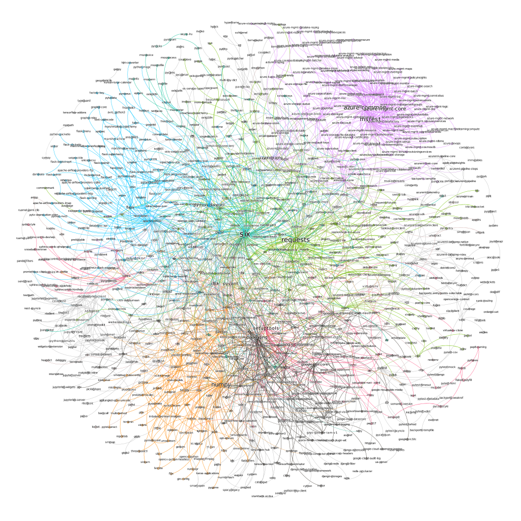
We can use networkx’s draw_network method to visualize our communities. However, gephi provides much better visualization so we will use that instead.

Each community is a different color. Lines represent dependencies and the name of a package is proportional to its centrality measure. The upper right purple community is Microsoft Azure packages for example. And the lower leftish orange community mostly consists of data science packages.
six and requests (and setuptools) seem to be the most important packages in our graph.
One final point:
>>> print(nx.is_directed_acyclic_graph(G))
True
Our graph is a DAG as expected. That also means we can sort our nodes. Topological sorting is a linear ordering of vertices such that for every directed edge from u to v, node u comes before v in the ordering. Printing the first and last 10 for our graph, we get:
>>> print(list(nx.topological_sort(G))[:10])
['awscli', 'mlflow', 's3fs', 'ruamel-yaml', 'pyspark', 'importlib-resources', 'lightgbm', 'gensim', 'gcsfs', 'google-cloud-logging']
>>> print(list(nx.topological_sort(G))[-10:])
['pyjwt', 'oauthlib', 'requests', 'six', 'cffi', 'certifi', 'urllib3', 'idna', 'charset-normalizer', 'pycparser']
We can think of the first elements (list starting with awscli in the above example) as frontends. Basically, they are the packages for human interaction and other packages do not really depend on them. Correspondingly, the second list (the list starting with pyjwt above) can be considered as backends. Those are the packages that mostly other packages depend on.